The compensation metrics every HR team should be tracking

Getting compensation right is high stakes.
Not only is compensation a major source of spend for companies, it’s also a major decision-making factor for employees when choosing whether to join or remain with a company.
That means it’s important for HR and People teams to easily understand the effectiveness of your compensation strategy and be able to answer the big questions like:
- Are we paying our employees fairly?
- How does our compensation compare to our wider industry and competitors?
- How successful are we at closing the gender pay gap?
- Is compensation a factor causing employees to leave our company?
And that means metrics.
But which compensation metrics are actually valuable to track? And how can an HR dashboard help to ensure they’ll actually be used to make improvements at your company?
That’s exactly what we’ll cover in this article.
5 must-include compensation metrics for any HR dashboard
As a general rule, the compensation metrics that you track should be tailored to your specific compensation strategy and your overall goals and vision for compensation at your company – there is no one size fits all here.
However, there are a handful of metrics related to compensation which are likely to be universally useful for HR and people teams to track – let’s take a look.
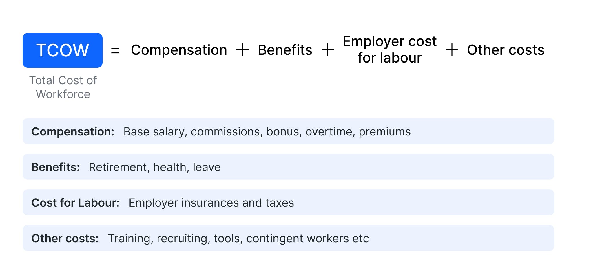
Total cost of workforce (TCOW)
A measure of the budget a company spends overall on employees. This typically includes base salaries, variable compensation, core benefits (e.g. pension, insurance, healthcare), and employer taxes or contributions (which can differ significantly across locations).

Many companies also use the same process to give a ‘total cost of employee’ when considering hiring for a new job position, determining the potential gross monetary cost of the new hire based on the likely: base salary, variable pay, core benefits, employer taxes/contributions. This is helpful for budgeting and forecasting, and is something that business and finance colleagues are always keen to understand.
Annual employee turnover rate
Employee turnover rate measures the number of employees who leave an organisation within a specific time period – usually an annual figure.
It’s calculated by taking the number of employees who left the company in a given year and dividing this by the average number of employees the company had in that year (number of employees at the start of the year plus the number of employees at the end of the year, divided by two). The resulting figure is then multiplied by 100 to get a percentage.

Employee turnover rate is a useful metric because it gives an indication of employee satisfaction over time, helping you to identify any trends or issues to be improved – and it’s worthwhile separating out your voluntary and involuntary separations to add context to those trends.
It isn’t strictly a compensation specific metric, but given that we know compensation and benefits are a key factor in employee turnover – the #1 driver of retention and #2 driver of attrition according to a McKinsey study – it’s an important metric to monitor.
Compa ratio
The compa ratio (also referred to as market ratio) is calculated by taking an employee’s current salary and dividing it by the target rate (typically the midpoint of the salary band for that role).
It’s useful to evaluate salary band progression, understanding where employees sit within their salary band, their progression within that salary band so far, and their likely progression in future years. It also gives a simple indicator of whether they may be under or over paid as a salary band outlier.
If the resulting ratio is 1.0, the salary is exactly at the midpoint of the range. Anything less than 1.0 means the salary is below the salary midpoint, and above 1.0 means it is above.

Target percentile vs actual
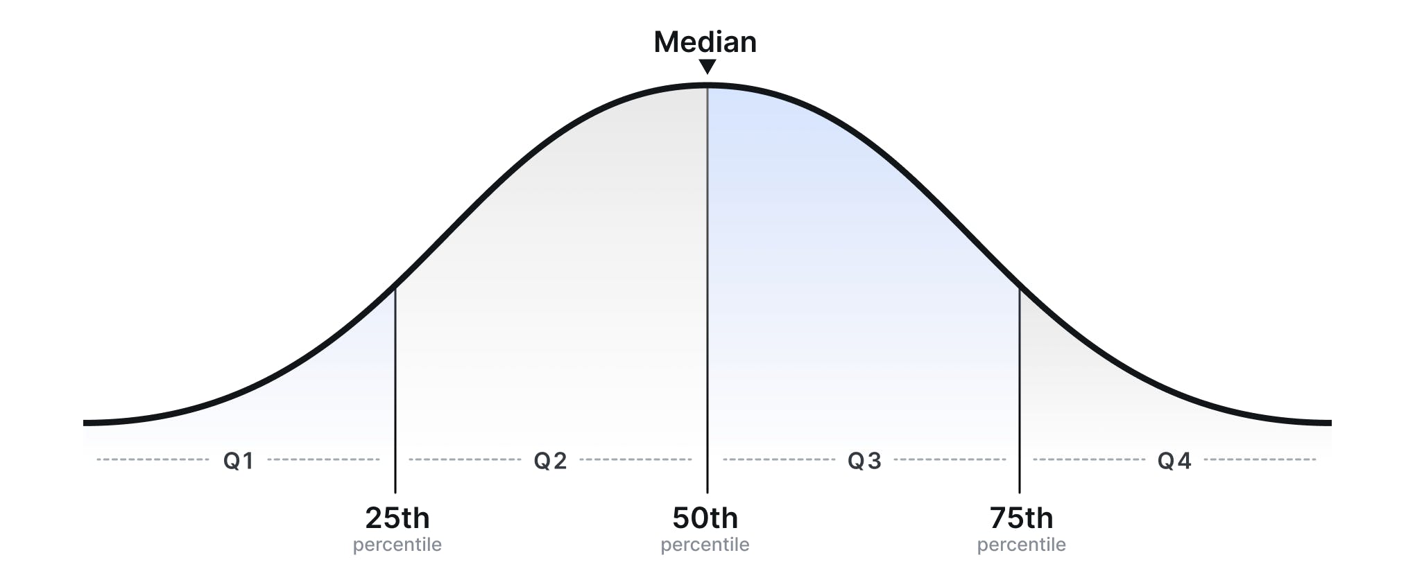
Percentiles are a statistical figure used to look at a company’s own compensation for a role in relation to the distribution of other salaries other companies pay for this role
For instance, a salary offer which is at the 75th percentile means that 75% of salaries for this role in the wider role lie below this value and 25% lie above this value. So, a company which has a target of offering salaries at this 75th percentile is offering very competitive compensation and likely has a goal to attract top talent to the company.

But, compensation isn’t a static thing.
External factors such as changing economic conditions will impact the wider market. And internal factors such as lack of a pay progression system play a role too – an employee could have been offered their salary at the 50th percentile, but if they’ve been at the company for a while and their pay hasn’t progressed since joining, they may no longer be receiving competitive compensation – a phenomenon known as ‘salary compression’.
Therefore, it’s important for HR teams to monitor actual employee compensation in comparison to their target percentile to ensure this target is being maintained throughout.
Internal pay equity
As well as understanding how competitive compensation is compared to the wider market, it’s also important for HR teams to ensure that pay is equitable internally, across the company.
Internal pay equity typically refers to the percentage of employees who are within a salary band (vs outliers), and the compa ratio can be used to determine this. This enables companies to identify any gaps and discrepancies where employees are not receiving equal pay for equal work.
For example, the most common issue that arises within pay equity is discrepancies between genders, with employees being paid differently depending on their gender – and the most commonly used metric for that is the gender pay gap.

Uncovering these discrepancies means that they can be resolved to ensure fair compensation practices – and comply with incoming regulations in this area, such as the EU Pay Transparency Directive.
This is often a manual process for HR teams. Salary benchmarking tools like Ravio eliminate that, making it simple to find real-time data, calculate metrics, and analyse compensation across an organisation – including automatically highlighting any gender pay gap within your compensation practices.
For more information on Ravio head to our website – we’re offering 15% off Ravio Pro in partnership with torq.partners: simply enter the discount code DKEXWL*.
Plus, if you aren’t sure which compensation metrics to start with, we’d recommend booking a 1-2-1 chat with the team at Torq Partners.
The value of creating an HR dashboard – don’t let those metrics go to waste
Just as compensation metrics are only really useful when tailored to your company’s strategy and goals, they’re also only really useful if they’re visible.
One approach is to create an HR dashboard.
In an HR dashboard you bring together those different metrics and sources of data that are key to understanding your compensation approach, into a visual dashboard.
It makes it easier for HR teams to analyse and interpret the metrics, comparing data and identifying trends or areas for improvement. At the same time, it provides a simple snapshot which can be shared with other teams and stakeholders to make for better-aligned and more-informed conversations and decisions about compensation.
There are many tools out there to help with creating an HR dashboard, including:
- Ravio: a compensation benchmarking platform which enables you to input your company data and easily visualise it against market averages for key planning areas including target vs actual percentiles, gender diversity progress, headcount mix, and more. A free version is available and Ravio Pro (additional features) is an affordable option – especially with the 15% discount available using code DKEXWL*.
- Looker Studio (previously Google Data Studio): a visualisation tool from Google. It’s free and easy to integrate with a range of third-party platforms (and all Google products) but has limited visualisation options.
- Zoho Analytics: allows HR teams to create and distribute interactive dashboards to a wide audience. This is an affordable option.
- Power BI: allows HR teams to create interactive dashboards, conduct in-depth analysis, and easily share insights with stakeholders. It’s ideal for teams using Microsoft Office, but can be expensive.
- Tableau: enables HR professionals to explore and present data in a visually appealing manner. It has advanced analytics features, so is ideal for organisations with complex data, but the pricing becomes expensive if used across a large organisation.
- Excel: a widely available and versatile tool that can be used to create basic HR dashboards with charts and graphs, reports, and data analysis tools.
To explore which of these tools and metrics might make most sense for your company and how to implement these, set up an initial chat with Martin Beischl, Principal at torq.partners.
*Ravio x torq.partners offer eligibility:
Access to Ravio for your HQ country is free through our give-to-get model. When you contribute data for a job position, you get free access to our real-time benchmark for that position. Free access to Ravio is only available to companies with 25+ employees.
Ravio Pro gives you access to real-time compensation benchmarks across 15+ countries, as well as real-time market trends, advanced analytics, and a dedicated CSM. The Ravio Pro offer is available to new customers of any size. If switching from Ravio’s free platform to Ravio Pro, the offer is only applicable if the switch happens within 3 months of joining Ravio’s free platform. The offer is only available once per company. The offer is applied on a yearly contract commitment. The offer is applicable for companies <1000 employees only.
Use code DKEXWEL on our landing page to get 15% off Ravio Pro for the first year of use, in partnership with torq.partners.